 I figured this little blog was in need of a fresh 'afters' injection following all the 'befores' ugliness of my master bedroom in progress posts - it's slowly getting there though and I promise lots of (hopefully lovely) after shots to redeem myself.
So, in the mean time, I thought I'd share this fun little comparisons refurb.
You may have seen these chairs before on my blog here and here.
Before
I scored a few of them for $5 each from eBay. I was hoping to use them in my dining room though when I went to pick them up and saw them in person I knew straight away that wasn't gonna happen. I'm sure they were previously dining chairs for either NBA players or wookies (i.e. larger than usual peeps). They were huge - and hugely wrong in my dining room.
Given they were big enough to be used as occasional chairs I thought I'd refurbish them individually and pair each one with a co-ordinating footstool to make cute little ensembles.
No. 1
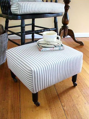
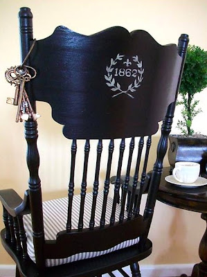
The first got a predominately black 'toile and ticking' makeover.
The footstool was made from scratch and cute vintage castors were added to the feet.
I hand-painted a little french inspired emblem on the rear of the head rest just for something a bit different - and because I may, or may not be, slightly obsessed with anything resembling typography :-)
I decided to invert the colour scheme for the second one and go with predominately white.
It's amazing how just changing the colour of the chair frame has given such a different feel.
Again, the footstool was made from scratch and the feet are actually cut down old side table legs.
No. 3
Back to black for this third one though in a more rustic style inspired by french grain sacks. Seriously, who doesn't love them some burlap? Sigh...
The little stool was a curbside find. It just needed a fresh coat of paint and some new upholstery.
Before (already painted the base before I remembered to take a pic - oops!)
After
I hand-painted the stripes on the stool with craft paint after marking out some narrow lines with painters tape.
I designed the cushion artwork then printed it onto iron-on transfer paper. I cut around the outline of the graphic pretty exactly before transferring it so there was no excess adhesive residue.
I'm a pretty neutral girl myself and these are all kinda conservative though I've still got one left I'm hoping to makeover in a more out-there theme.
What colour, pattern and style would you choose?


.JPG)

.JPG)
.JPG)

.JPG)
.JPG)

.JPG)

.jpg)

Yorum Gönder