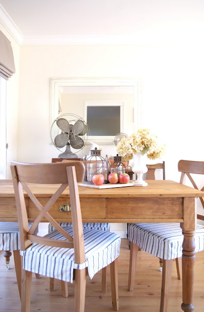
More a nook than an actual room, our little dining area forms the southern end of our living room.
The neutral palette combines loads of natural elements and character-rich texture - with nothing too pretentious - for a relaxed yet fresh space.
So, whilst it's nothing super special, it's warm, inviting and very....me!
Here it is just before we moved in:
And here's the floorplan to give you an idea of the layout:
As per our living room, we painted out all the dirty apple green walls in pale cream and all the timber trim in gloss white. Taupe linen romans were also added in place of the heavy green drapes.
The previous owners had already installed the faux timber floating floor which, whilst it wouldn't necessarily have been my first choice, is nice, clean and neutral.
Pretty much all the furniture and decor is either second-hand, thrifted or gifted (you can find the item origin and cost breakdown post here).

The big mirror, with its pale frame which makes it almost undistinguishable from the wall, really helps create an illusion of space (that's the kitchen doorway reflected in the above pic - just in case you cared!).
I'm a sucker for pretty, earthy vignettes and for now, to tie in with the living room, there's loads of terracotta and twine plus white ceramics and some vintage finds.
I've been too slack to add pics of my own wedding to this photo gallery yet though it's the perfect sentimental filler for this narrow little wall space and I'm looking forward to watching it grow!
I'm still searching for the perfect light fixture at the right price (vintage gal pendant or wrought iron chandy) and am contemplating painting the chair frames white and mirror border dark.....we'll see though.
As mentioned previously, you can now read the item origin and cost breakdown post here.
So again, just for comparisons sake. Here's the space before:


.JPG)
Yorum Gönder